How to read a weather forecast: what every number actually means
Pubblicato il 2026-08-18 · 10 min di lettura
Opening a weather page and seeing "27°C, 40% rain, wind 12 km/h, UV 9" takes less than a second. Understanding what that line means — and what it does not mean — completely changes whether you take an umbrella, schedule an outdoor run, or postpone painting the house. This guide walks through every number in a modern forecast and explains how to read it without becoming a meteorologist.
Temperature: the number everyone checks and almost nobody questions
The temperature shown is air temperature at two metres above ground, measured in the shade and away from heat sources. That standardisation exists because without it comparing cities would be meaningless: the same day can read 27°C in a regulation weather shelter and 43°C on the dashboard thermometer of a car parked on asphalt.
This is why the site temperature almost always feels "too low" for someone standing in the street at noon. Nothing is wrong: the value describes the air, not a surface baking in direct sun. Road asphalt can exceed 55°C while the air above it reads 30°C.
Another common source of confusion is the difference between the current temperature and the daily high. If at 9 a.m. the site shows 22°C and the forecast high is 31°C, there is no contradiction: the high is the peak that will be reached later, typically between 2 p.m. and 4 p.m., once the ground has stored enough heat to warm the air above it. The daily minimum, in turn, almost always occurs shortly before sunrise rather than in the middle of the night.
Why the high changes during the day
Today's high is a forecast right up until the moment it happens. A cold front arriving early, cloud cover forming at 11 a.m. or an unexpected shower can shave two or three degrees off the peak. So a value shown in the morning may be revised in the afternoon — a sign of a system working, not of an error.
Feels like: the body measures heat exchange, not temperature
The feels-like value is an attempt to describe what the human body perceives rather than what the thermometer records. It combines air temperature with relative humidity, wind speed and, in some models, solar radiation.
The logic is straightforward: the body loses heat mainly through sweat evaporation, conduction and convection with the air, and radiation. Each environmental variable interferes with one of those paths:
- High humidity suppresses sweat evaporation. At 90% humidity sweat drips instead of evaporating, cooling fails, and 30°C feels like 38°C.
- Strong wind accelerates convective heat loss. On a 10°C day with 40 km/h wind, it feels closer to 4°C.
- Dry air favours evaporation and makes 35°C tolerable in a desert climate — the same reading that would be suffocating on a humid coast.
That is why comparing "35°C in Phoenix" with "35°C in Singapore" without looking at humidity makes no sense. And in winter, a feels-like value below the actual temperature is not an exaggeration: it reflects the body's rate of heat loss, which is what actually causes hypothermia.
Chance of rain: the most misread number in meteorology
"40% rain" does not mean it will rain 40% of the time, nor that 40% of the city will get wet. The operational definition used by weather services is the probability that at least 0.1 mm of precipitation falls at a specific point within the stated interval — usually an hour or a day.
In practice: out of 100 days with the same atmospheric conditions observed today, rain fell on roughly 40 of them at that point. It is a measure of confidence, not intensity.
Which leads to a common trap: a day with 30% probability and 25 mm of forecast accumulation is potentially more disruptive than a day with 80% and 1 mm. The first is a localised, heavy downpour likely to flood wherever it lands; the second is a near-certain drizzle that wets the pavement and passes. Always read probability together with millimetres.
What millimetres mean in practice
- 0.1 to 1 mm — drizzle; the ground gets damp, an umbrella is optional.
- 1 to 5 mm — light rain; you get wet, but routines continue.
- 5 to 20 mm — moderate rain; wet roads, slower traffic.
- 20 to 50 mm — heavy rain; flooding risk at known trouble spots.
- Above 50 mm in a few hours — severe event, with real risk of flooding and landslides in vulnerable areas.
Wind and gusts: two numbers, two different uses
The wind speed displayed is the sustained average, measured at ten metres over ten minutes. The gust is the instantaneous peak in the same period. The gap between them matters far more than it seems.
An average of 20 km/h with gusts to 70 km/h is the scenario that snaps branches, lifts poorly fixed roof tiles and makes scaffolding work or drone flying dangerous. A steady 35 km/h with no gusts is annoying but rarely damaging. When planning anything wind-sensitive — sailing, kite flying, erecting structures, spraying crops — read the gust, not the average.
Direction is practical information too: it always names the point the wind comes from. "SE wind" means air arriving from the south-east and blowing towards the north-west. On coastlines this often tells you whether the day brings humid marine air or dry continental air.
Relative humidity: why 60% is not always the same thing
Relative humidity measures how much water vapour the air holds compared with the maximum it could hold at that temperature. The last three words are crucial: warm air holds far more vapour than cold air.
The practical consequence is that relative humidity rises at night and falls in the afternoon even with no change in the actual amount of water in the air. It falls because the air warms and its capacity grows; it rises because the air cools. That is why the lowest readings of the day coincide with the highest temperature.
Reference ranges for comfort and health:
- Below 30% — dry air; airway irritation, dry eyes and skin. The WHO treats readings below 20% as a state of alert.
- 40% to 60% — the comfort range for most people.
- Above 80% — muggy, laundry will not dry, mould and dust mites thrive.
Atmospheric pressure: the indicator that anticipates change
Sea-level pressure hovers around 1013 hPa. The absolute value matters less than the trend:
- Rising pressure — sinking air, clouds dissipating, settled weather ahead.
- Falling pressure — a front or low-pressure area approaching; rain and wind tend to increase.
- Sharp drop over a few hours — a classic signature of an organised storm forming.
People who feel joint pain or migraines when the weather turns are not imagining it: rapid pressure changes affect gas expansion in body cavities and are a documented trigger for part of the population.
UV index: the number that demands action, not just reading
The UV index measures the intensity of ultraviolet radiation reaching the surface. It varies with sun angle, altitude, cloud cover and ozone thickness — and has no direct relationship with temperature. A cold mountain day can carry extreme UV; a hot overcast day, low UV.
- 0 to 2 (low) — no protection needed for most people.
- 3 to 5 (moderate) — sunscreen and sunglasses for prolonged exposure.
- 6 to 7 (high) — avoid sun between 10 a.m. and 4 p.m.; wear a hat and cover up.
- 8 to 10 (very high) — fair skin burns in under 20 minutes.
- 11 or above (extreme) — burns in under 10 minutes; exposure discouraged.
Snow reflects up to 80% of UV radiation, sand around 15% and water about 10% — which is why beach and ski burns are worse than the index alone would suggest. And every 1,000 metres of altitude raises intensity by roughly 10%.
Sunrise, sunset and the blue hour
Sunrise and sunset times are calculated astronomically and are the most accurate data in any forecast — they do not depend on an atmospheric model. Remember that usable light starts before sunrise and lingers after sunset: civil twilight lasts 20 to 30 minutes at mid latitudes, and considerably longer near the poles.
Visibility and air quality
Visibility is the distance at which a large object remains distinguishable. Below 1 km, road travel demands extra care; below 200 m, airports switch to instrument operations or close. Fog, wildfire smoke and dust knock this number down fast.
The air quality index summarises pollutant concentrations — above all fine particulate matter (PM2.5), which penetrates deep into the lungs. On wildfire or temperature-inversion days, a poor index is a reason to postpone outdoor exercise, especially for children, older adults and people with asthma.
From observation to your phone: how the data travels
It helps to know where each number originates. The cycle starts with observation: surface stations, ocean buoys, radiosondes launched by balloon twice a day, weather radars and, above all, geostationary and polar-orbiting satellites. Satellites alone deliver millions of measurements per hour over oceans and uninhabited regions where no stations exist.
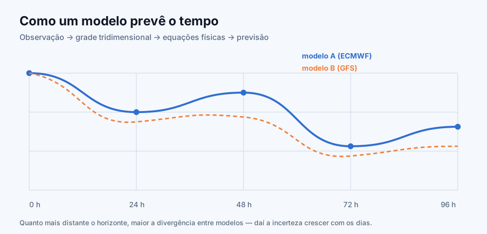
Those measurements feed assimilation, where a supercomputer merges observations with the previous forecast to build the most likely picture of the atmosphere at that instant. This picture — the analysis — is the starting point. The model then solves the equations of fluid dynamics and thermodynamics step by step, advancing a few minutes at a time until it covers days of forecast.
The raw output is a three-dimensional grid of numbers. Before becoming "27°C and 40% rain" on your screen it goes through statistical post-processing, which corrects known regional biases and converts physical variables into human-readable information. When a service refreshes every 15 minutes, that is post-processing updating with the latest observations — not a full new model run, which happens every 6 hours.
Putting it together: deciding with a forecast in hand
- Check current conditions and temperature to calibrate what is happening now.
- Read the hourly curve, not just the daily summary — that is where the dry window from 2 p.m. to 5 p.m. appears.
- Combine probability and millimetres before deciding on umbrellas or outdoor events.
- Check the gust if the activity involves height, light structures or boats.
- Check UV if you will be exposed for more than 20 minutes between 9 a.m. and 4 p.m.
- Re-check: forecasts within 24 hours are highly reliable; 3 to 5 days are good for planning; beyond 7 days indicate tendency, not certainty.
You can apply this right now with the weather in New York, the weather in London, or the 7-day forecast for Sydney. To understand why numbers shift between visits, read why weather forecasts get it wrong and the guide to feels-like temperature, UV index and air quality.
Why services disagree, and what to do about it
Two apps showing different numbers for the same street is not a bug, it is a consequence of how forecasting works. Each service picks a model or blend of models, picks a grid point near your location, and applies its own statistical correction. Coastal cities, mountain towns and large urban areas amplify those differences because the underlying terrain inside a single grid cell varies enormously.
A useful habit is to treat divergence as a signal rather than an annoyance. When two reputable services agree closely, confidence in that outcome is high. When they split — one showing a dry afternoon and the other showing showers — the atmosphere is in a state where small differences matter, and you should plan for both outcomes rather than trusting either.
It also helps to know what a service does not tell you. A single daily icon compresses 24 hours into one symbol, which is why a day marked "rain" can be dry for the ten hours you actually spend outside. The hourly breakdown almost always carries more decision value than the headline icon.
Quick questions
Is tomorrow's forecast reliable? Yes. Twenty-four-hour forecasts get the dominant condition right in roughly 90% of cases in well-observed regions.
Why do two sites show different values for the same city? Because they use different models (ECMWF, GFS, ICON) and different grid points. A 1°C to 2°C spread between services is normal.
How often does the data change? Current observations refresh every 10 to 15 minutes; full global model runs, every 6 hours.